
 English
 Español
Zhongsheng
Zhongsheng
Zhongsheng
Zhongsheng
Zhongsheng
Zhongsheng
Zhongsheng
Zhongsheng
Zhongsheng
Zhongsheng
Zhongsheng
Zhongsheng
Zhongsheng
Zhongsheng
Zhongsheng
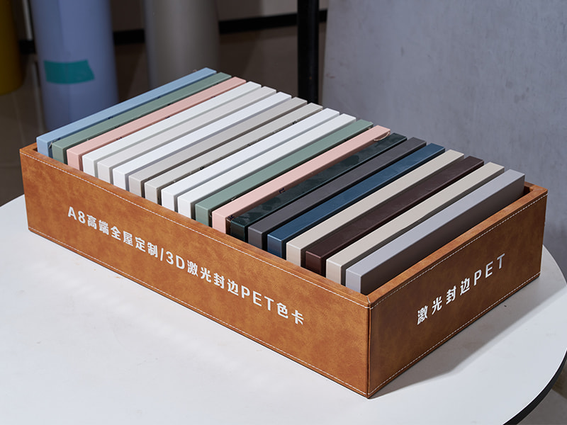
Current Texture Trends in Decorative Sheets
1. Tactile Wood Grain Replication
Decorative sheets increasingly mimic the physical feel of natural wood through embossed-in-register (EIR) technology. This process aligns the printed grain pattern with a textured roller, creating a surface where latewood rings feel slightly raised and earlywood sections remain smoother. Manufacturers achieve depth variation between 20 and 80 microns, which falls within the detectable range for human fingertips. Popular species replicas include oak with open-pore textures, walnut with fine cathedrals, and ash with strong wire-brushed effects.
2. Matte and Soft-Touch Finishes
Matte surfaces (gloss level below 15 units measured at 60°) have gained preference over high-gloss finishes in residential settings. Soft-touch coatings add a thin polyurethane or acrylic layer that reduces the friction coefficient to approximately 0.3–0.4, producing a velvety sensation. These surfaces show fewer fingerprints and light scratches compared to glossy alternatives, making them suitable for high-contact furniture such as TV stands and bedside tables.
3. Industrial and Raw Material Expressions
Concrete, linen, and oxidized metal textures appear on decorative sheets designed for loft or minimalist interiors. Unlike earlier smooth prints, current versions incorporate micro-roughness patterns that reflect light unevenly. For example, a linen-textured sheet might repeat a twill weave structure at 0.5 mm intervals, while a concrete sheet uses random pinhole depressions below 0.2 mm depth.
4. Examples of Texture-Design Combinations
|
Interior Style |
Dominant Texture |
Typical Gloss Level |
Common Application |
|
Scandinavian |
Light wood, fine matte |
5–10° |
Wardrobe doors, bed frames |
|
Industrial |
Concrete, brushed metal |
10–20° |
Desk surfaces, shelving |
|
Japandi |
Linen, rice paper |
3–8° |
Sliding panels, low cabinets |
|
Modern classic |
Satin wood, subtle grain |
15–25° |
Dining tables, headboards |
Adapting Decorative Sheets to Modern Interior Design Needs
1. Coordinating with Variable Lighting Conditions
Modern interiors use layered lighting—warm LED strips, cool daylight from windows, and focused spotlights. Decorative sheets must maintain visual consistency across these sources. Manufacturers test samples under 2700K, 4000K, and 6500K light sources. Sheets with neutral gray undertones (rather than yellow or pink) adapt more successfully. For rooms with north-facing windows, designers specify sheets with slightly higher light reflectance values (above 45%) to compensate for lower natural brightness.
2. Matching Scale to Room Dimensions
A small apartment (under 50 m²) benefits from decorative sheets with fine, continuous textures that do not break the visual plane. Large-format patterns—such as oak planks wider than 200 mm in print—tend to overwhelm compact spaces. Conversely, an open-plan living area (over 80 m²) can accommodate pronounced textures like deep wire-brushed wood or large-scale stone veining without appearing busy. Designers also consider furniture placement: a bookcase standing against a heavily textured wall may create visual clutter, so the sheet texture should be calmer on vertical planes.
3. Reducing Visual Fatigue in Home Office Settings
With more people working from home, decorative sheets on desks and shelving units need to avoid excessive pattern repetition. High-contrast wood grains or bold marble veins can cause visual distraction during computer work. Preferred solutions include ultra-matte surfaces (gloss below 5°) with low-contrast grain lines—for example, bleached oak or grey ash. These textures provide warmth without competing for attention. Some manufacturers offer sheets with random grain repetition cycles longer than 2.5 meters, reducing noticeable repeats across a 1.8-meter desk width.


